Building Vue 3 components with Tailwind CSS
Mary Gathoni

February 21, 2023
0 mins readVue is a popular JavaScript framework for building versatile web interfaces. Some of its most compelling features are its easy integration into existing code-bases and lightweight framework, making it easy for developers to start using in their frontend projects.
At the core of Vue is a composable component approach to building UI web applications. Components are reusable pieces of code that you can use as the building blocks of your applications. Vue’s component model enables you to build self-contained components with logic, content, and styles in a single location.
When styling these components, you can use a framework like Tailwind CSS to include the styles directly in the markup, encapsulating the component even further. Tailwind CSS is a CSS framework that incorporates reusable classes for styling user interface (UI) elements. You can use these classes to apply stylistic elements like fonts, colors, padding, margins, animations, and transitions. For example, using a text-black attribute will display all of an element’s text in black. These classes are composable, and you can combine them to implement any design.
In this tutorial, you’ll learn how to build Vue 3 components with Tailwind CSS by creating a responsive article card component. The complete project code is available here.
Prerequisites
To follow along, you’ll need:
An up-to-date version of Node.js and npm installed
A text editor like Visual Studio Code (VS Code)
Knowledge of the command line
Familiarity with Vue and CSS
Creating your own Vue 3 components with Tailwind
To begin, create a new Vue 3 project. Run the following command in your terminal to install and execute create-vue, the official Vue project scaffolding tool for building vite-powered projects:
You should receive a prompt with a list of optional features. Name the project vue-tailwindcss and choose No for the rest of the options.
Now, navigate to the project folder using cd vue-tailwindcss and run npm install to install the project’s open source dependencies from npm.
Execute npm run dev to start the application in a development environment.
This command should start the app on the localhost server:
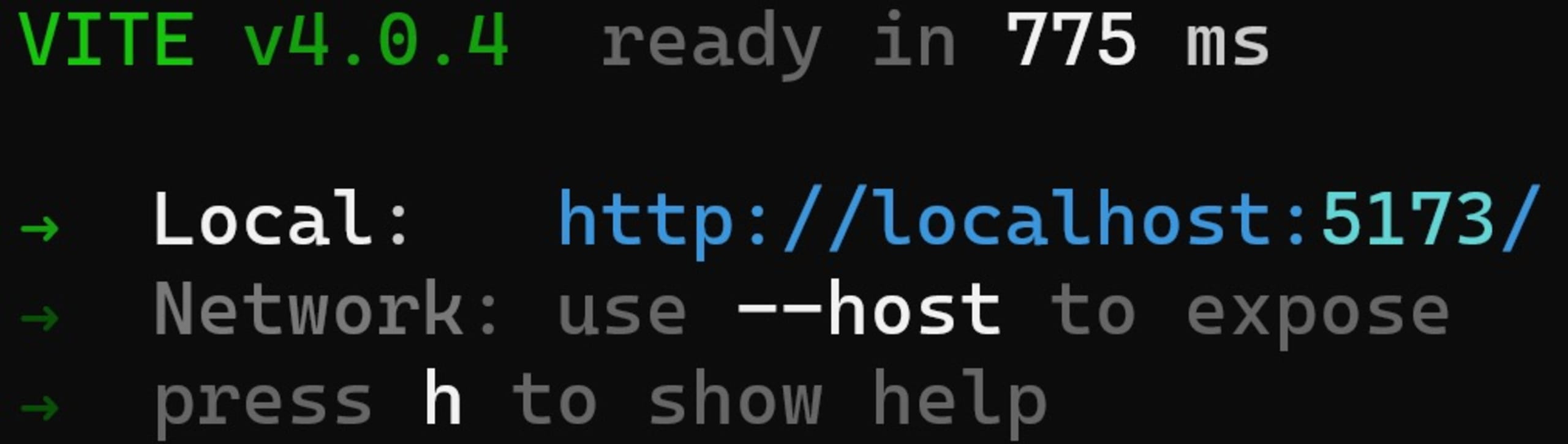
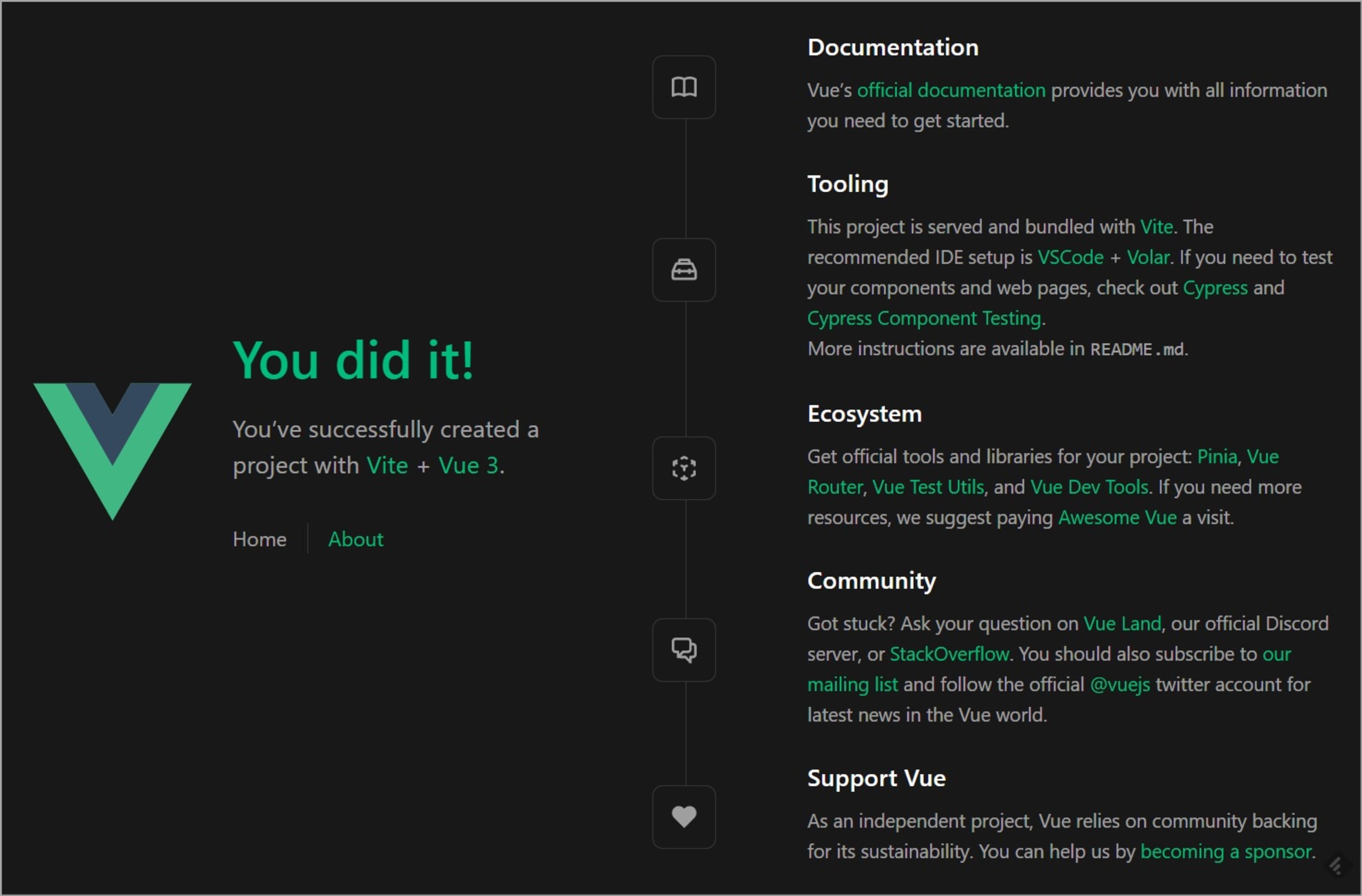
Navigate to the indicated local URL to view the app:
Now it’s time to set up Tailwind CSS in the Vue app.
How to set up Tailwind with Vue
To begin, run the following command in the terminal:
This command installs Tailwind CSS and its peer dependencies (autoprefixer and postcss) via npm.
Next, generate your tailwind.config.js and postcss.config.js files by running the command below. You’ll use these files to configure and customize Tailwind:
This command should create tailwind.config.js at the project root with these details:
You also created postcss.config.js and configured the tailwindcss and autoprefixer plugins:
In tailwind.config.js, modify the content array to include all the paths to your pages and components. This will configure Tailwind to remove unused CSS classes from the final output, reducing the file size.
Your tailwind.config.js file should now look like this:
Next, create a new file named index.css in the src folder of the project and add the following:
You used the @tailwind directive to include Tailwind’s base, components, and utilities styles in your project. Later, when you build the project, Tailwind will automatically replace these directives with the styles you dictated to it.
Now, import index.css into our ./src/main.js file to start using it:
Note that you should delete the line importing the assets/main.css file. This will prevent you from using vanilla CSS.
You can now start creating components using Tailwind.
How to create Vue components
To learn how to use Tailwind in Vue components, create a card component for an article.
Then, create a new file named ArticleCard.vue in the src/components folder. Add the following code:
The code above creates a template named ArticleCard, which defines a card component consisting of an image and an informational blurb about the article.
To display it in-browser, clean up the homepage by deleting everything in the App.vue file. Then, import the ArticleCard component into the script section of App.vue:
Then, use it in the template:
The next step is to style the card using Tailwind CSS utility classes.
Utility classes explained
With vanilla CSS — and a few other CSS frameworks — you can use custom CSS classes to style elements on a page.
Here’s an example of a link element styled with the link-wrapper and link classes:
Why use Tailwind CSS?
The problem with this approach is that you must generate meaningful class names every time you need to style an element. Alternatively, you need to remember an extremely long, descriptive name whenever you want to reuse a class. You also must write significant amounts of CSS, as each class name you add to a page has accompanying styles. So, as your application grows, the CSS files also grow, contributing to an increased bundle size and leading to slow loading times.
However, in Tailwind CSS, you can use predefined CSS classes called utility classes. Utility classes provide common styling options like flex, text-alignment, border, margin, padding, and color. These options enable you to style pages without writing CSS.
Let’s see what the previous link example would look like when styled with Tailwind CSS:
You now replaced the style object and the custom classes with the following utility classes:
p-8sets the padding to 8px.font-mediumsets the font weight to 500px.text-xlsets the font size to 1.125rem and the line height to 1.75rem.text-blacksets the text color to black.
Using utility classes reduces the amount of CSS and makes it easier for anyone looking at the code to understand the intention of the styled elements without referring to a stylesheet.
Tailwind offers a variety of utility classes, which you can find in their utilities documentation.
Styling a card component with Tailwind CSS
Now that you’re familiar with utility classes, it’s time to style the card component.
Start by modifying the src/components/ArticleCard.vue file to use Tailwind’s utility classes:
With the new styles, the card component should look like this:

In addition to the utility classes, you used modifiers to style the card. Note the hover:underline class of the <a/> tag, where hover is the modifier.
In Tailwind, use modifiers at the beginning of a utility class name to describe the state you want to target. In the example above, you targeted the hover case, but you could also target the focus state using the focus:text-violet-200 class or the active state using active:text-violet-600.
You can use various Tailwind CSS modifiers depending on the condition you want to target. For the full list, check out the Tailwind CSS documentation.
So far, the card component looks great on larger screens, but as you reduce the screen size, it appears increasingly crowded:

Fortunately, you can change the card layout based on screen width.
How to handle breakpoints in Tailwind CSS
Tailwind CSS allows you to conditionally apply a utility class at different breakpoints. By default, there are five breakpoints, each taking effect at certain minimum widths:
sm— 640pxmd— 768pxlg— 1024pxxl— 1280px2xl— 1536px
To handle a breakpoint, prefix the utility class with the breakpoint, followed by a colon (:).
Consider the following button:
Tailwind applies the w-16 class for small screens, w-32 for medium screens, and w-48 for large screens.
You can use breakpoints to change the layout, size, color, or any other property without using media queries. You can also customize the screen sizes inside tailwind.config.js if the default sizes don’t meet your design needs.
For example, the following code will override the lg screen size:
In your article card component, use breakpoints to change the layout of the card and adjust the image size:
Below is the modified code. Note the first <div/> and <img/> tags:
Here are the changes you’ve made:
The
md:flexandmd:max-w-2xlmodifiers convert the card component to a flex container with a maximum width of 48 rem on medium and large screens. On small screens, themax-w-mdclass sets this width to 28 rem.In the
<img/>element,md:h-fulldisplays the image at full height on medium and large screens, and theh-48class sets the height to 12 rem on smaller screens.
The resulting component looks like this on a small screen:

That’s it! You can now build Vue components using Tailwind CSS.
Once you’ve finished creating a Vue application, you can learn how to deploy it on Netlify with automatic security updates from Snyk. Create a free account and import your project to Snyk today to find and fix any vulnerabilities that may be hiding in your project’s dependencies — and protect your application from XSS and other security threats.
Conclusion
This tutorial showed you how to build a Vue 3 component using Tailwind CSS. Tailwind CSS is a utility-first framework that allows for a more efficient and streamlined workflow for building UI components. You can use utility classes to create responsive designs without referring to external stylesheets or remembering dozens of class names. Tailwind enables you to create your own design system by customizing default classes. Furthermore, it automatically removes all unused classes from the production build, helping you add less code to the final product.